Lecture slides
THE BRIEF
A personal project to improve upon typical lecture slides full of bullet points.
THE ACTION
For maximum legibility, I kept the text large so that it could be read from the last row in the classroom.
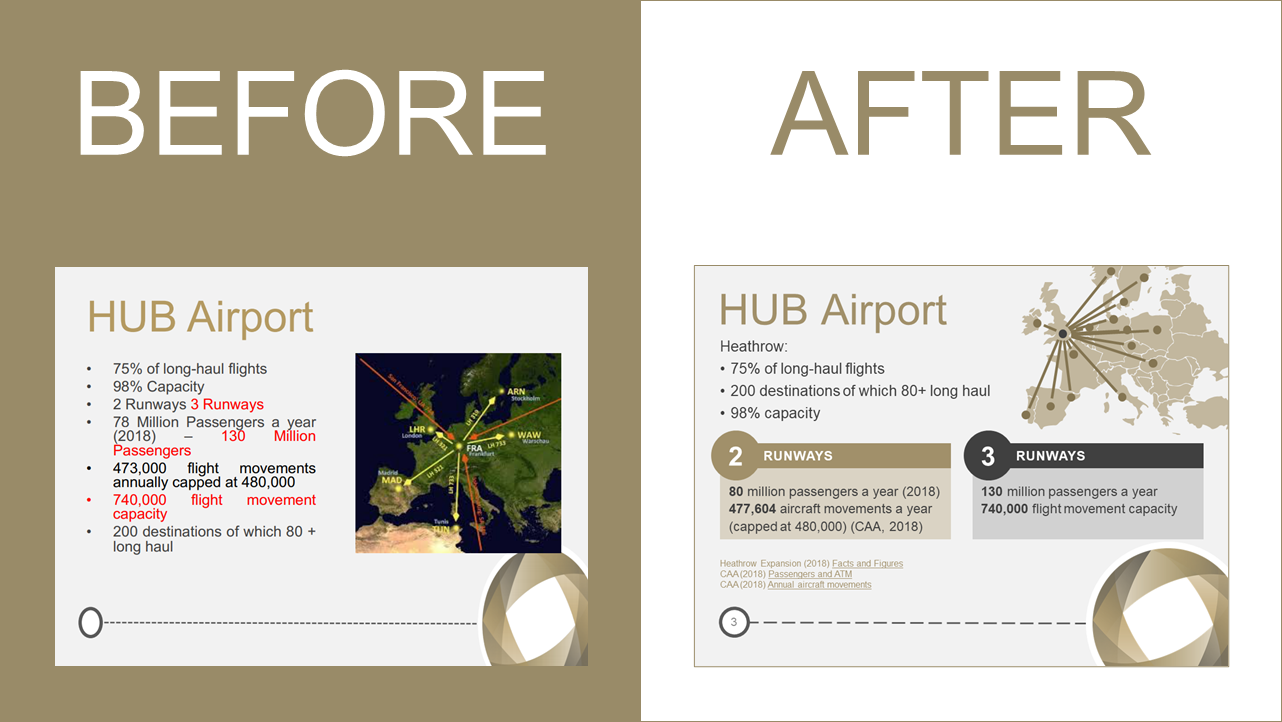
- The Hub Airport map centred on Heathrow replaced an image with Frankfurt in the centre as the slide text refers to Heathrow. 2 and 3 runways implications, numbers updated with links to references.
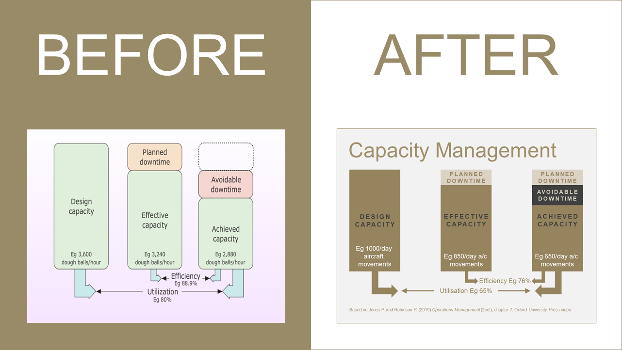
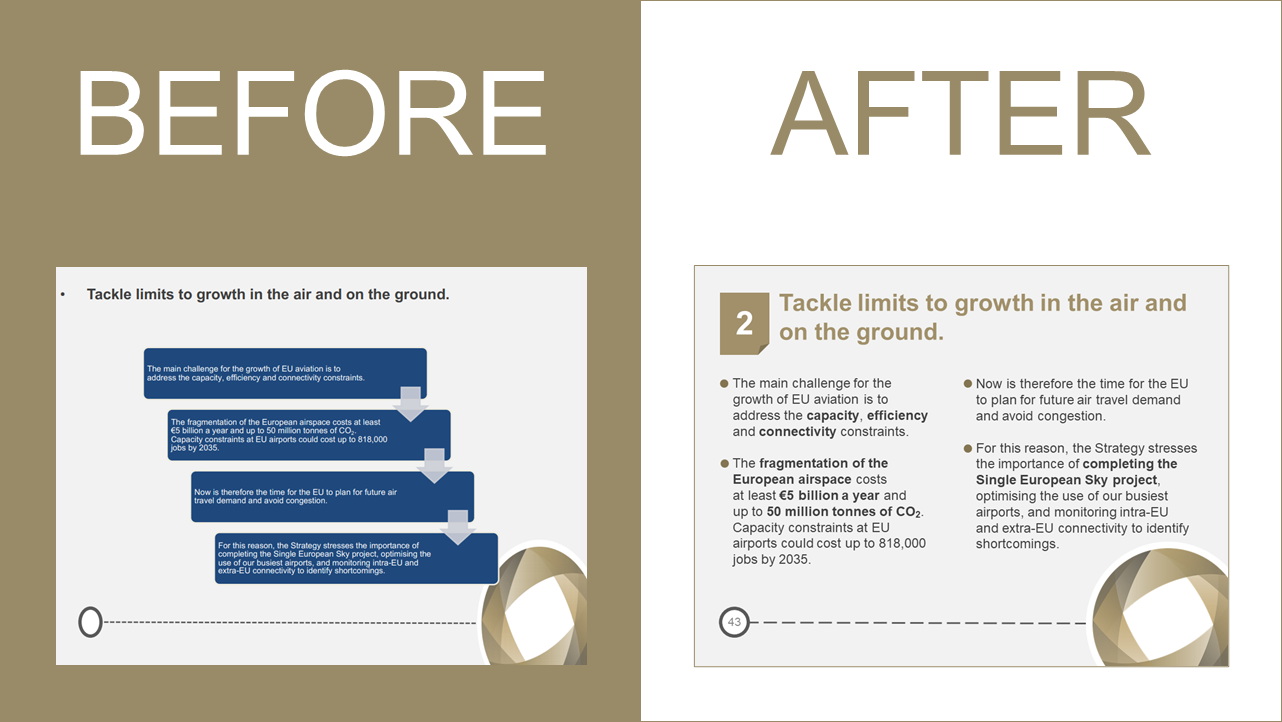
- The Capacity Management diagram adapted to airport capacity.
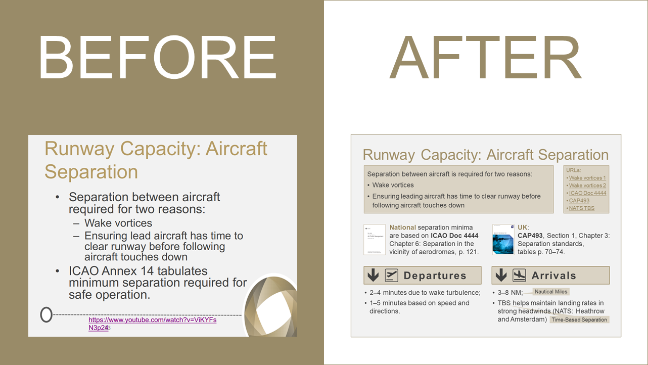
- Corrected the documents on the Separation slide with details for Departures and Arrivals.
I used the University font (Arial) as per the
Style Guide and the Tourism College's main colour with corresponding shades based on the brown wheel (an element of the original slide design). The slide proportions are as received from the lecturer (4:3 not 16:9).
THE OUTCOME
When slides are going to be uploaded to a VLE (Visual Learning Environment), downloaded by students, and re-used in subsequent courses by the training organisation, they could be professionally designed. If you are a lecturer, instructor or training manager and would like to impress your students with your slides, please contact me and I will be happy to help you.