Presentation design tips
Whether you are preparing for a long online presentation or providing an introduction to an online debate, these simple rules can help you pass your message in your meeting.
1. Keep the original slide ratio (16:9)
If your organisation provides you with a slide template, don't change the slide ratio (i.e. from 16:9 to 4:3). Doing so would change the proportions of the graphic elements in the template such as your logo. A circular logo would look like an ellipse and a square logo like a rectangle. It looks unprofessional and the audience may find this disturbing.
The online meeting software may be optimised for the 16:9 ratio slides. Sometimes the bottom of the 4:3 slides is not displayed and the audience cannot see the information at the bottom of the slide.
2. Keep high contrast
But not too high. Black font on a white background is good but a dark grey font colour may be better. Don't use light grey on a white background as for some attendees it may be difficult to read, as may be white text on a light blue background. The smaller the text, the greater the colour contrast should be. Large text will be easier to read even if colour contrast is small.
3. Use a sans-serif font
Sans-serif is a straightforward font without fancy endings, or significantly bolder and thinner parts. Sans-serif fonts are considered to be easier to read on screen. Contrary to that, a serif font has dots, thin lines or endings (examples: Times New Roman or Georgia). Serif fonts used to be more popular in print, e.g. newspapers or magazines. A sans-serif font looks more modern than a traditional serif font.
When we open PowerPoint, the default font is Calibri. I'd avoid it for this very reason: it shows that we haven't changed the default font, and may signal to the audience that we haven't given much thought to our presentation either. Another very popular font is Arial. Both are technically good (and sans-serif), but are proprietary to Microsoft and could present usage rights problems down the line if we want to use them for other publications. However, the default, built-in fonts are safe as they will also be installed on another computer with PowerPoint. If we open our presentation on another laptop, most likely the Arial and Calibri fonts will be displayed properly.
Google Fonts are free for commercial use (just don't try to sell the fonts themselves). Popular and decent looking fonts are: Open Sans (used by CANSO), Roboto (used by EUROCONTROL, IFATCA, NATS and Ryanair), PT Sans (GATCO), Lato (SESAR JU), Montserrat (Skybrary, this website), Raleway (York Aviation; also Open Sans), Quicksand (Aviation Action), Poppins. Examples of narrow fonts include Oswald and Anton, but we may just use Roboto Condensed if we would otherwise choose Roboto.
The WhatFont extension for Chrome helps identify fonts on websites. However, some organisations have unique fonts developed for them such as easyJet. Aktive Grotesk is an Adobe font (used by IATA). Avoid monospace fonts, they don't look harmonious.
The problem with the fonts that we installed ourselves is to remember to embed fonts when saving the presentation, otherwise these fonts will only be displayed on our machine but not on other computers if we open our presentation elsewhere. In PowerPoint: File > Options > Save > tick Embed fonts in this file > Embed all characters (best for editing by other people). If we forget to embed fonts, our chosen font will be substituted by another font, e.g. Arial or Calibri. Roboto is similar to Arial but Montserrat is much wider and when replaced, our text will look more narrow than planned.
4. One idea per slide*
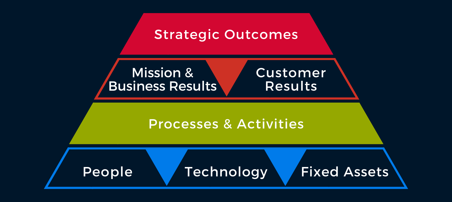
This is a good rule unless you need to compare ideas and show them side by side, or in a table. The "one idea per slide" rule is more appropriate for the general public, e.g. TED talks or politicians, not necessarily for highly qualified professionals who compare complex ideas on a daily basis, and are used to read charts in an instant.
However, don't cram everything together if your points can be placed on separate slides. There is no limit to the number of slides you can have if they are not overly complex. Twenty slides which are easy to digest are better than five with a lot of detail which takes time to read. A lot of detail may distract your audience. They will try to read while you are talking and will stop listening to you until they have read and understood the slide. Whatever you said while they were reading is not registered by your audience. You could add some easy slides in between those complex slides just to introduce or summarise the next/last idea in a few words.
On a busy slide, e.g. with three vertical panels, you can also display just the first panel of the slide in full colour, while the other ideas on the slide are greyed out. This way the audience knows that there will be more content but they only need to read the colourful part for now.
Although it is technically easier to only show the first part and not others, and make the other parts appear for the first time as you speak, I don't recommend it. This method is frustrating for those in the audience waiting to take a screenshot. Be sure to display the last part of such slide for long enough so that the audience can read it. I've been to webinars when the last part was displayed for a second before moving to the next slide. This is not sufficient to read the information.
5. Images
Ideas that are illustrated are easier to remember but avoid unnecessary decoration. Occasional icons instead of bullet points could enhance your presentation, as will one photo on the side or in the background which will help to convey the meaning. Not obvious images are more memorable than clichés.
Images to illustrate your presentation could be provided by your organisation (like NATS press office photos hosted on flickr), or graphics such as icons designed for your organisation (see IATA's or NATS's consistent styles and colour schemes). If downloaded from various sources, images could have different colour schemes. If their colours don't match, our presentation will look inconsistent. This is a common problem with logos. Logos should be designed to work in black and white but not all do.
One way to overcome it is to desaturate the icons or change their colour to white or grey; or change the photos colours just slightly so that they look more similar, another is to place them on a one-colour background (not white) which will dominate the slide, and another is to add borders or frames to the images (e.g. all blue - your organisation's blue tone).